Design

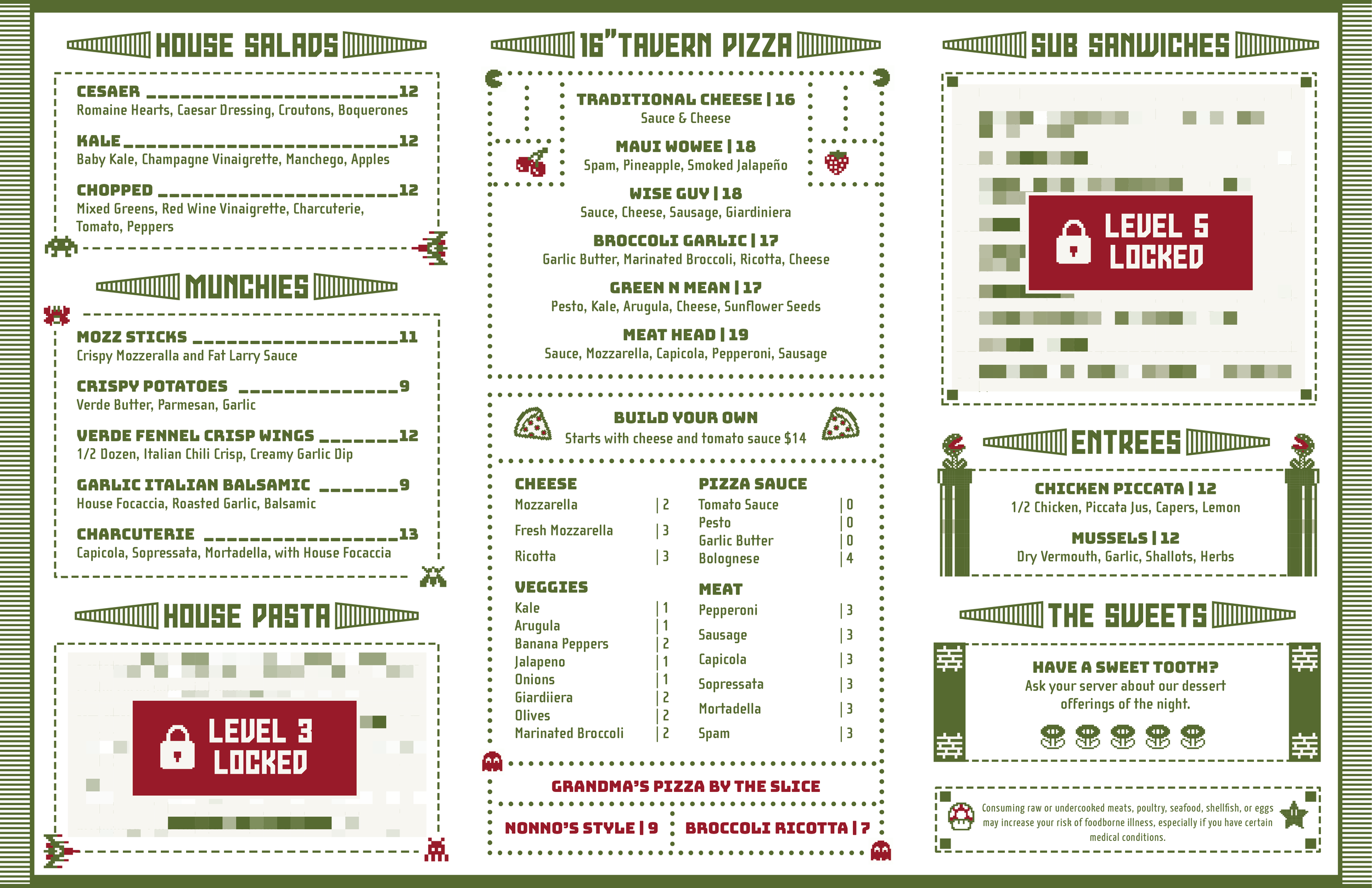
Nonno’s Family Pizza Tavern
-
We listened to our client’s vision of the restaurant space and operation. Our client desired a logo that represented a family-friendly pizza tavern with 1980s vibes.
-
We communicate clearly with our clients to understand how to navigate revisions and get to their desired brand identity. We dedicate ourselves to work down every creative avenue until we conceive the most fitting solution for our client’s brand.
-
Every client is presented with full-color and black and white options.
-
We used a website template builder to design a unique website for the Nonno’s Restaurant.
We designed specific and unique graphic elements to be displayed on the Nonno’s website.


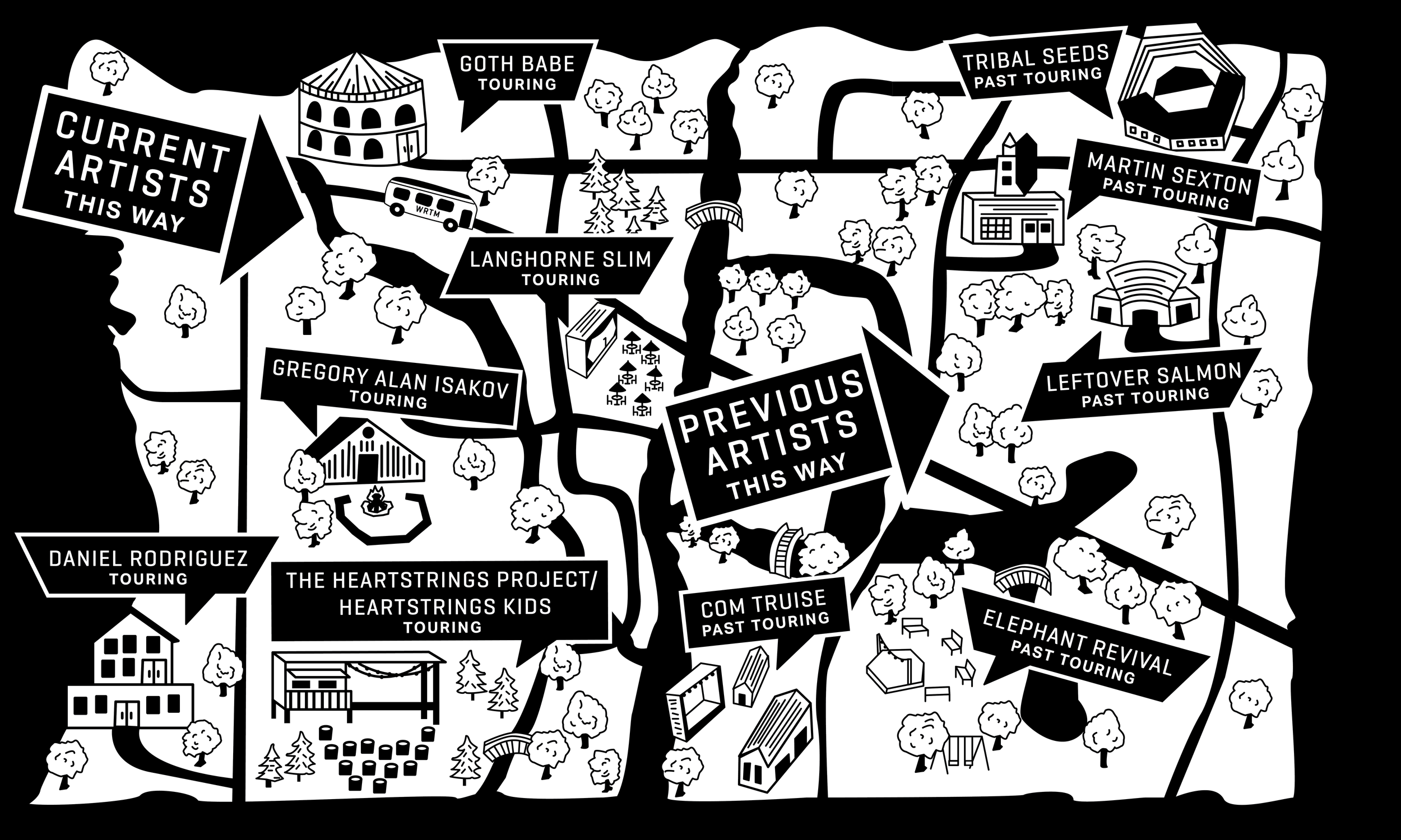
WEILD ROAD TOUR MANAGEMENT
-
WRTM is a Colorado based tour management company. This company strictly wanted B&W design. They wanted the logo to be more tour and movement-focused and stray away from typical music icons/symbols.
-
We communicate clearly with our clients to understand how to navigate revisions and get to their desired brand identity. We dedicate ourselves to working down every creative avenue until we conceive the most fitting solution for our client’s brand.
-
Every client is presented with full-color and black and white options.
-
We used a website template builder to design a unique website for the WRTM company.
We designed brand-specific graphic elements and GIFS to be displayed on the WRTM website.


A Little Frosting Bakeshop
-
ALF came to us during the pandemic. A badass baker and entrepreneur in need of a logo and website to sell her delicious and one-off treats. She wanted her brand to feel fun, funky, and retro.
-
We communicate clearly with our clients to understand how to navigate revisions and get to their desired brand identity. We dedicate ourselves to working down every creative avenue until we conceive the most fitting solution for our client’s brand.
-
Every client is presented with full-color and black and white options.
-
We used a website template builder to design a unique website for the AFL Bakeshop.
We designed brand-specific graphic elements to be displayed on the AFL website.
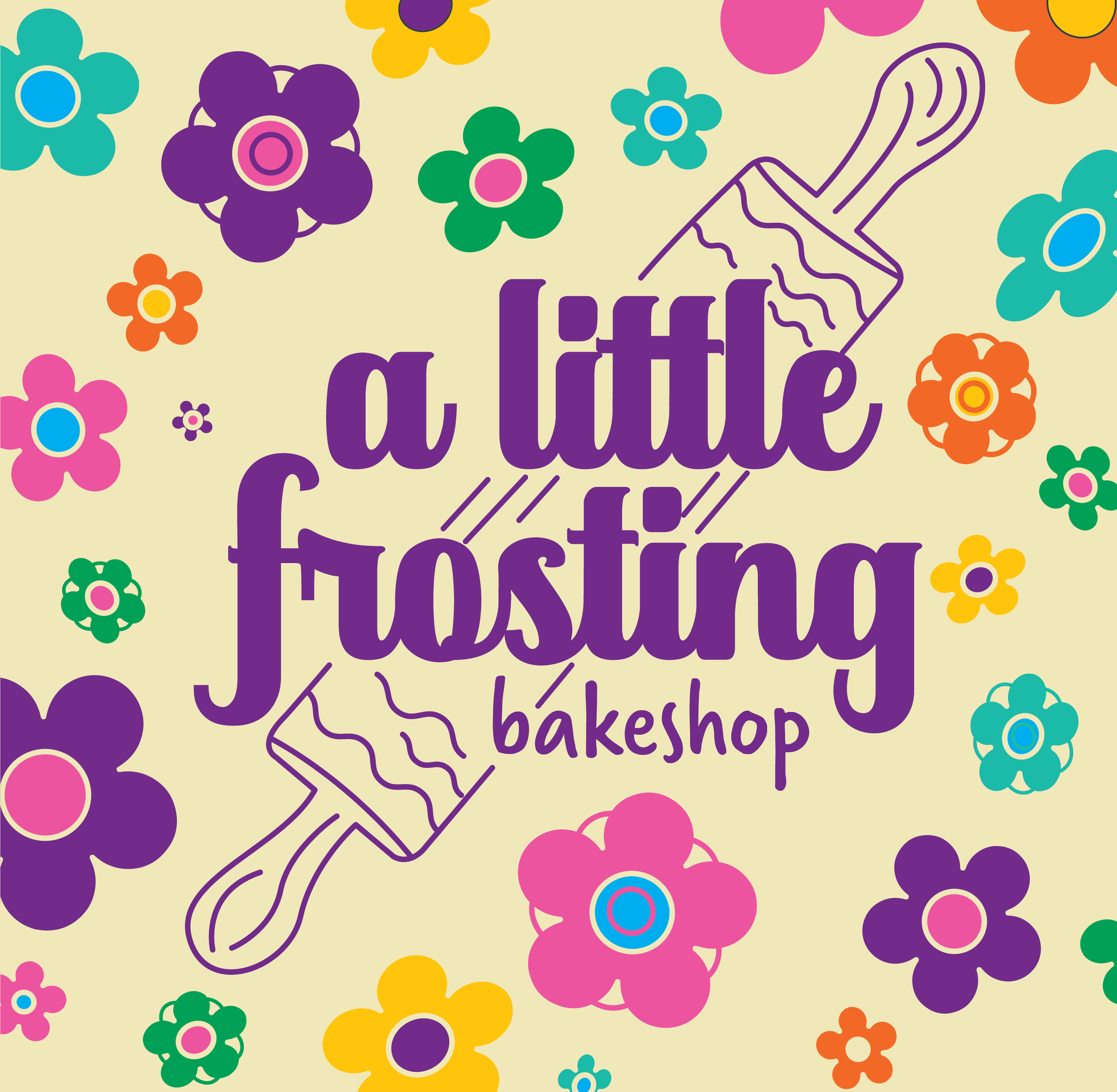
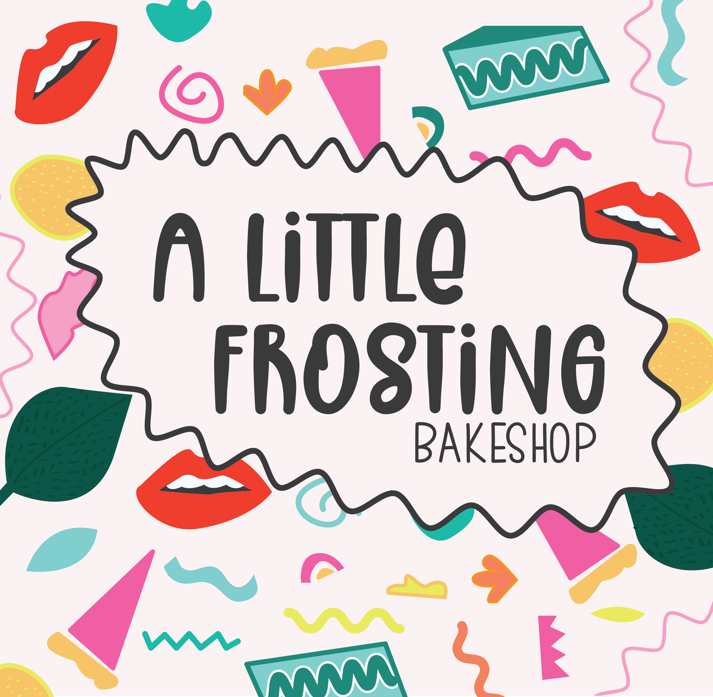
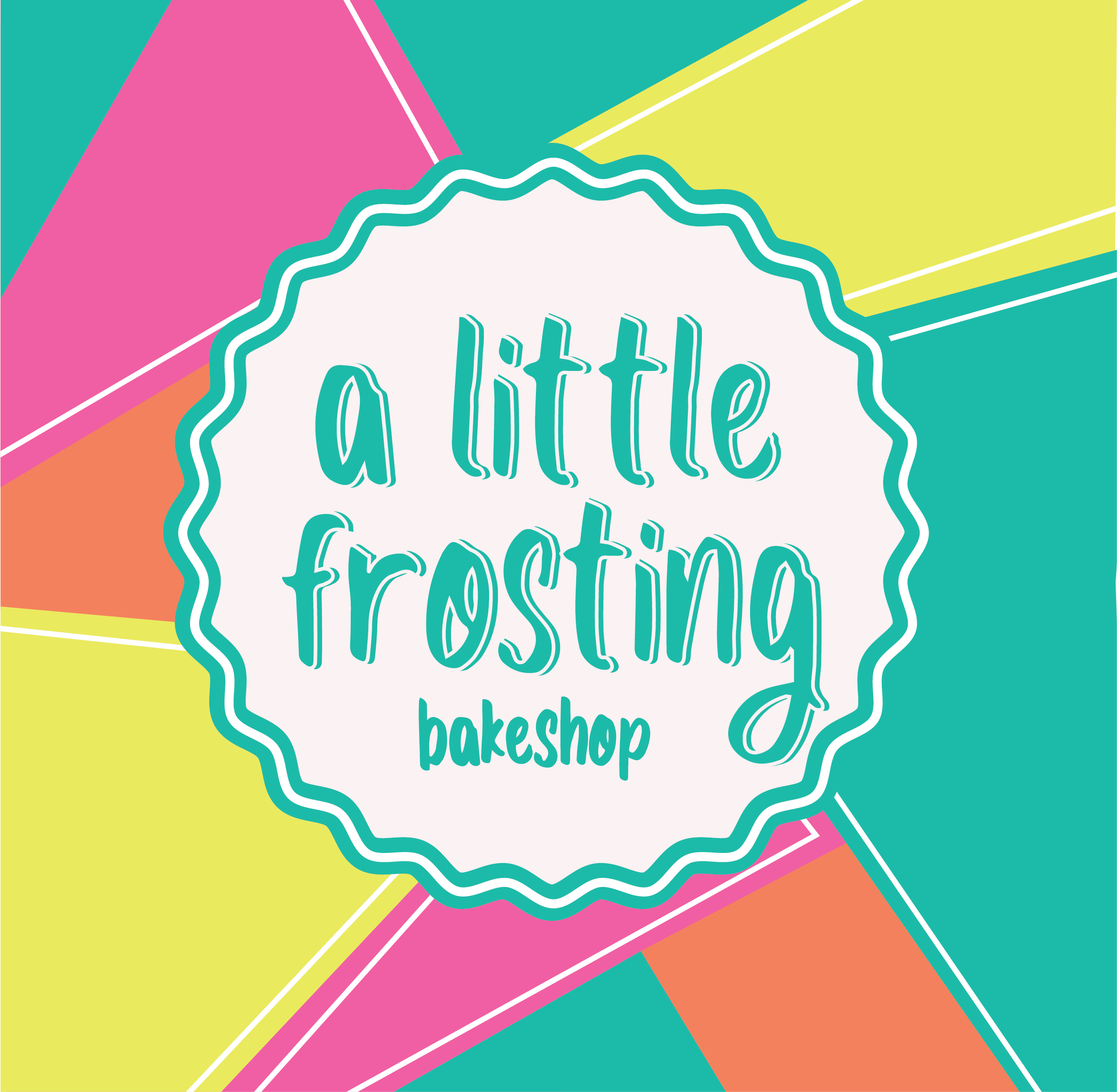
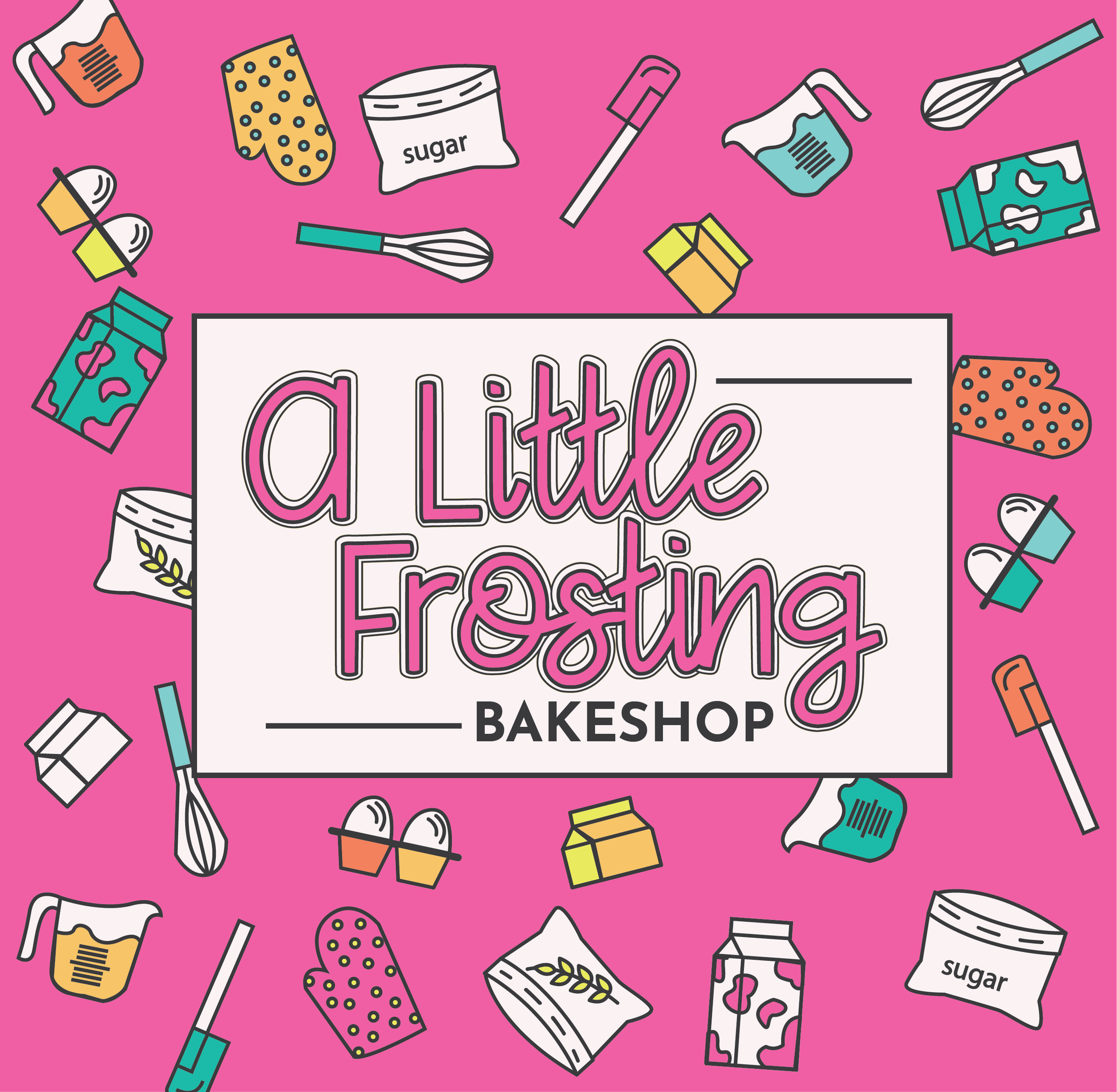
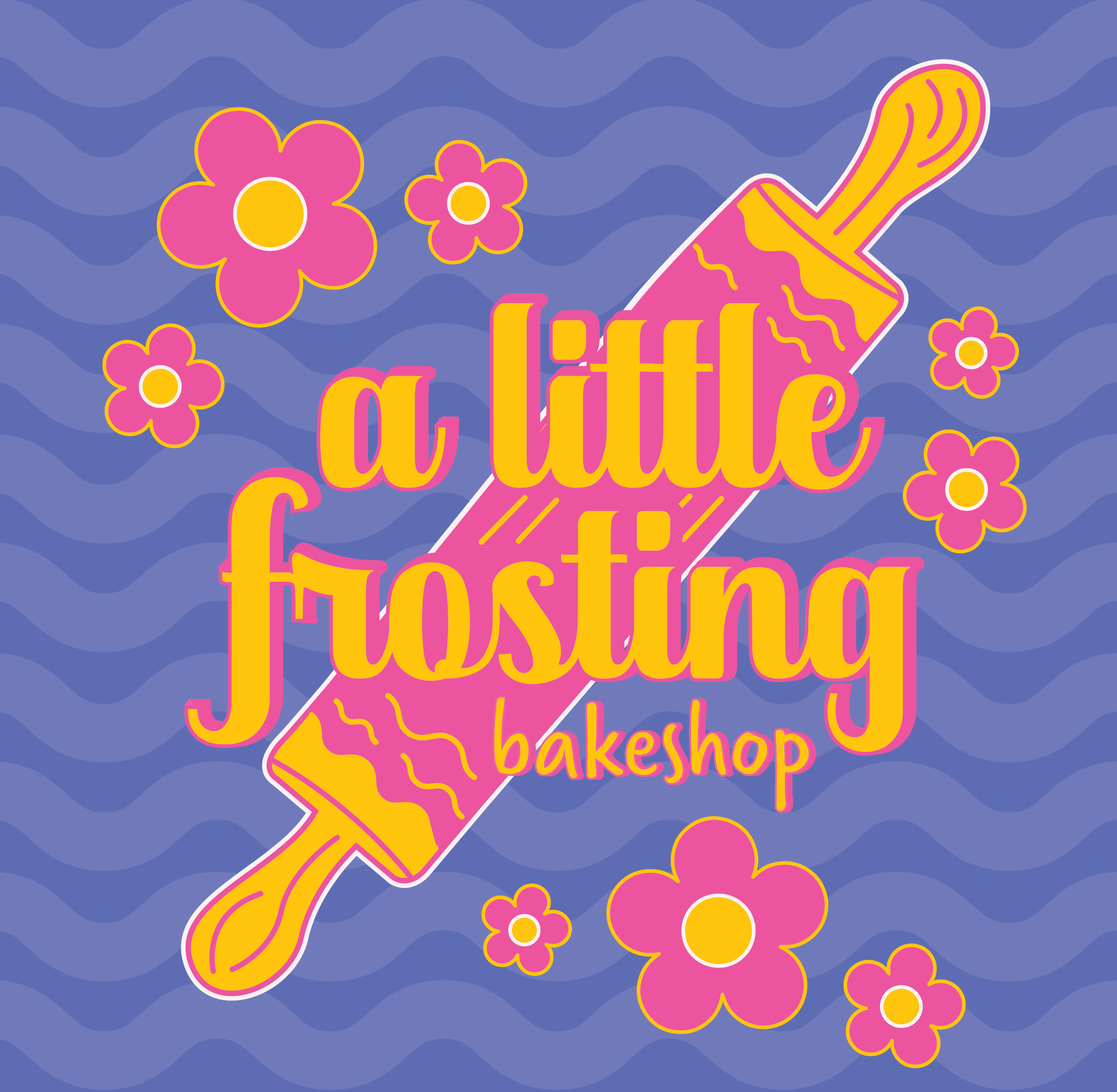
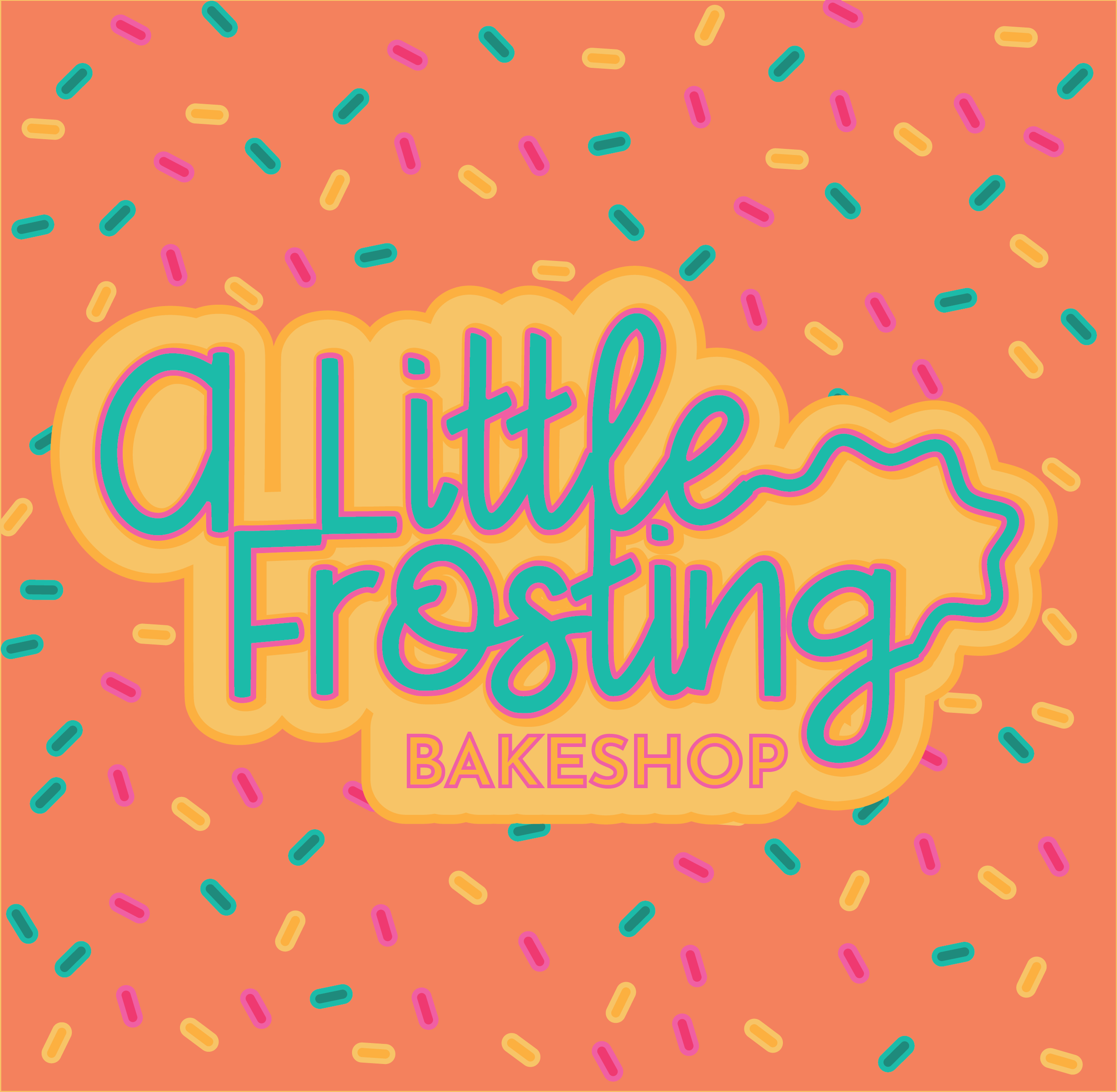

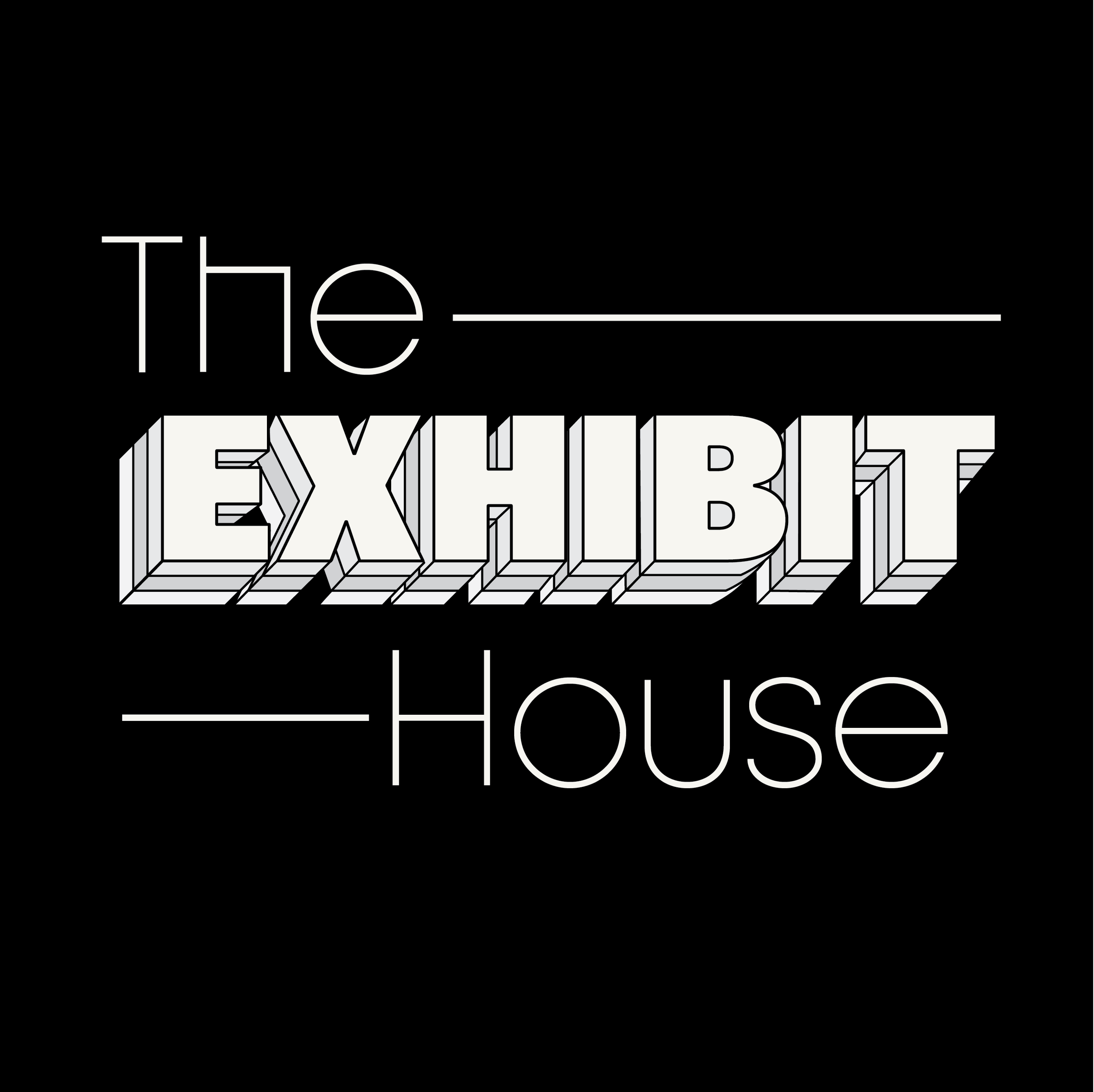
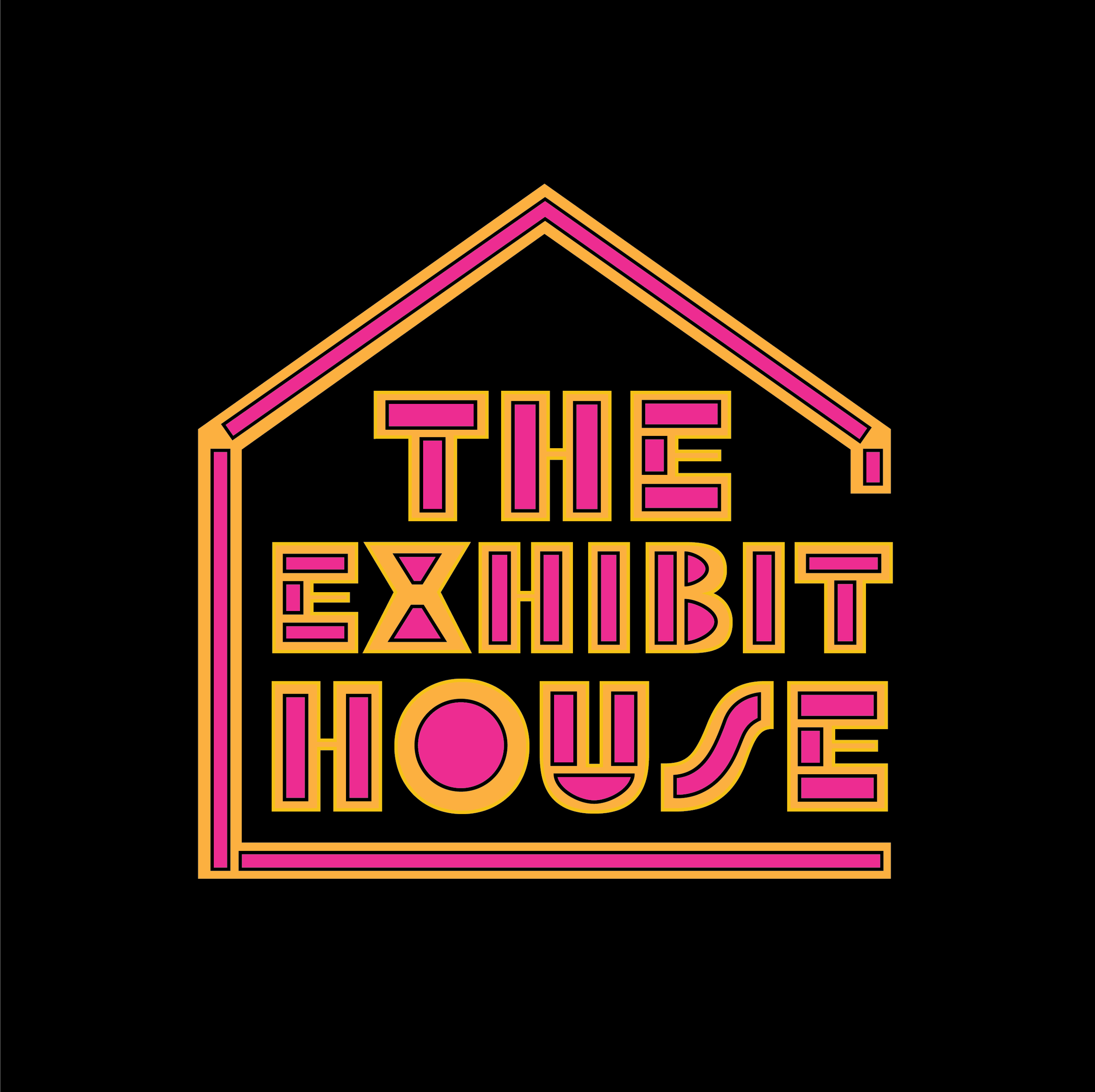
EXHIBIT House
-
This client was hosting a pop-up art gallery in downtown Chicago. This client took one of our ideas and shaped it into their own. Their current branding is not HHC derived at this time.
-
We communicate clearly with our clients to understand how to navigate revisions and get to their desired brand identity. We dedicate ourselves to working down every creative avenue until we conceive the most fitting solution for our client’s brand.
-
Every client is presented with full-color and black and white options.


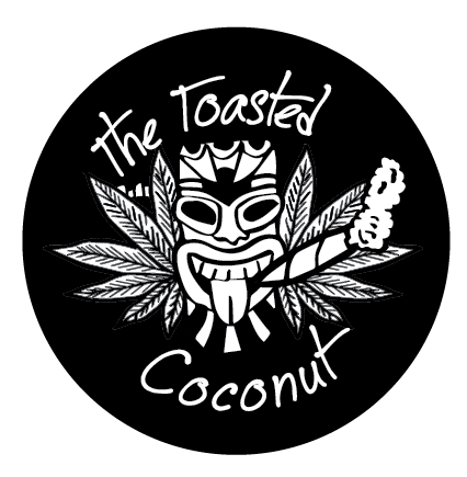
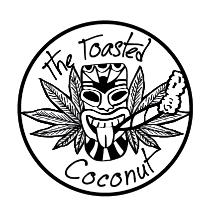
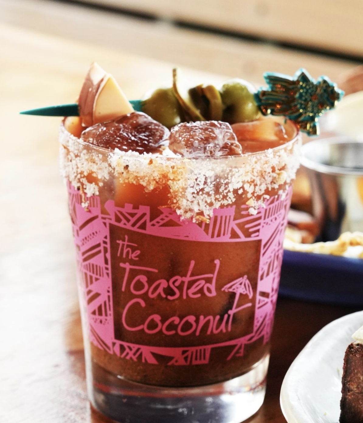
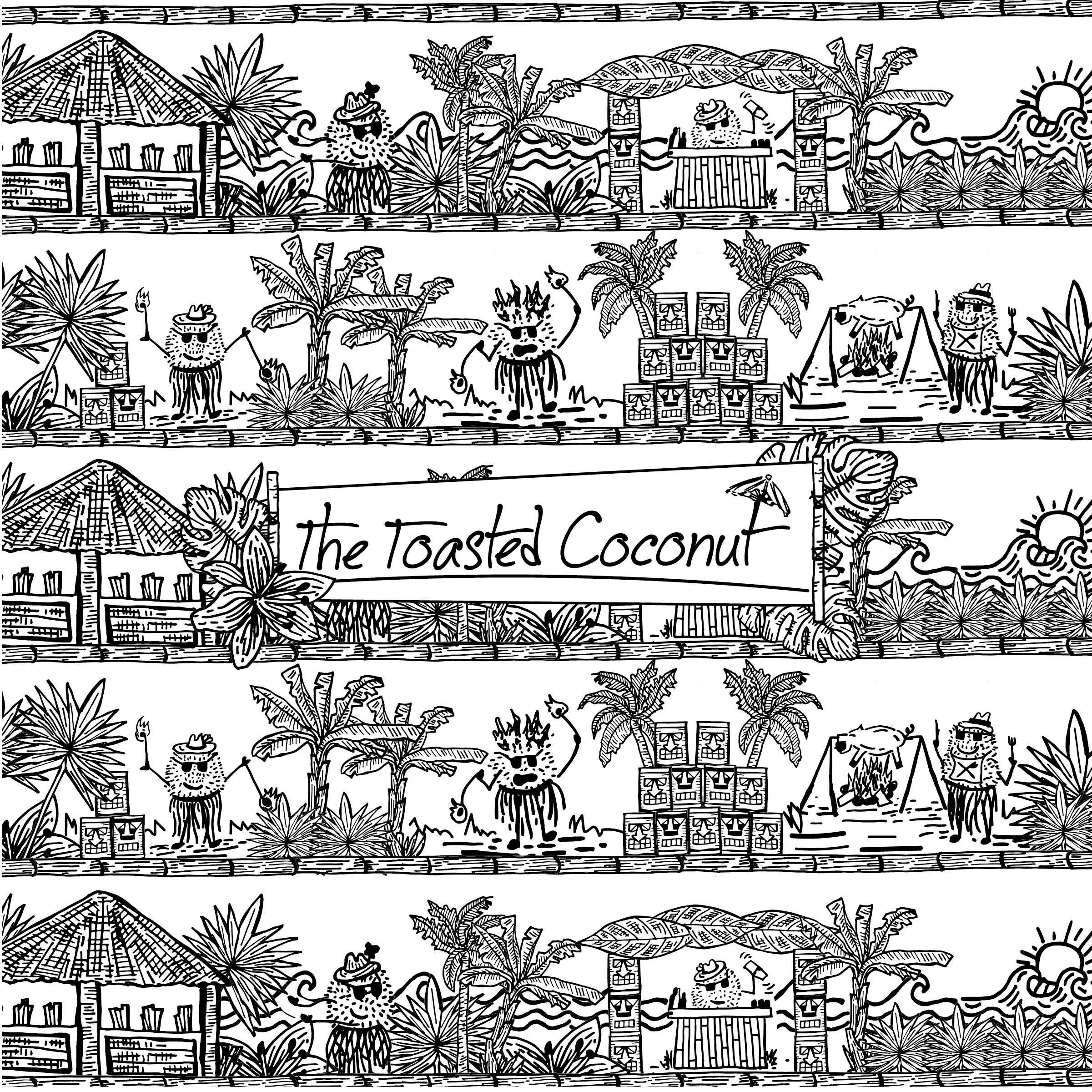
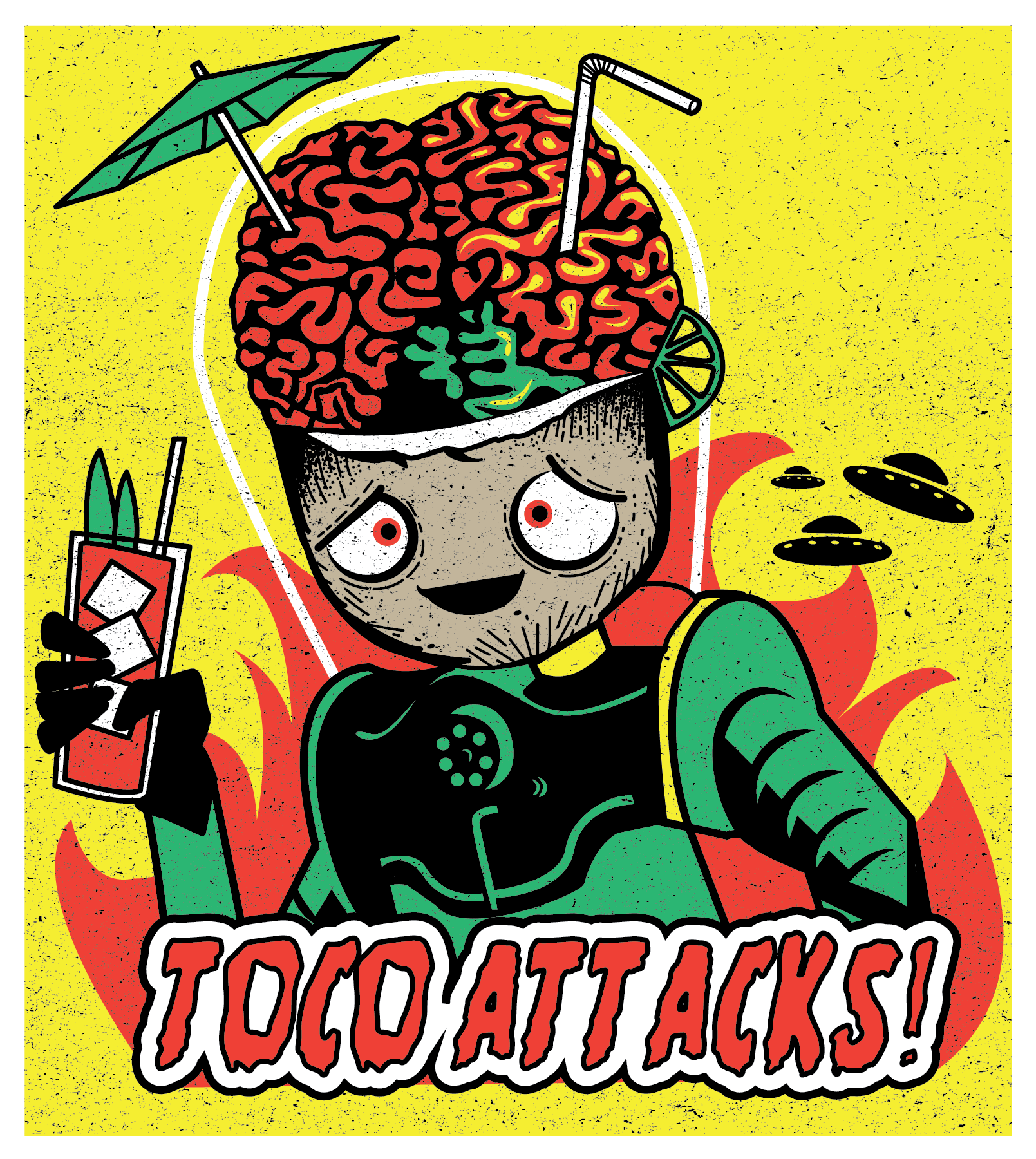
the toasted coconut
-
This client is based in Houston, TX, and was opening up a tiki-themed restaurant/bar. The client needed a logo, menu, and website design for their space. They wanted hand-drawn illustrations and a fun playful vibe.
-
We communicate clearly with our clients to understand how to navigate revisions and get to their desired brand identity. We dedicate ourselves to working down every creative avenue until we conceive the most fitting solution for our client’s brand.
-
Every client is presented with full-color and black and white options.